For many Singaporeans, a landed home represents the final square on the property ladder. But having more room to play with can also be tricky: How do you use all that extra space purposefully?
Jasper and Agnes from Ascend Design experienced that firsthand while designing this newly completed landed property for a family of three who had just moved from a much smaller home.
“Usually, for houses in Singapore, we don’t have a lot of extra space in the house to design with,” explained Agnes. “And even if it’s a larger home, every space is usually reserved for a specific function.”
The challenge was compounded by the fact that the house had already been newly fitted out. The monochromatic palette was too minimal for the couple’s tastes, while the heavy use of marble detailing felt too tacky. They wanted a complete reset: a home that would make them feel as though they’d left town altogether.
A Playground for Entertaining
Rather than embark on a costly structural overhaul, the designers decided to leave the home’s bones intact while creating pockets of space within it using subtle shifts in materials, mood, and theme. For example, the transition from the foyer into living is marked by smoother wall treatments
and a lighter palette that opens the space up both physically and visually.
The designers also resisted the temptation to fill the living room with excessive built-in carpentry, instead layering the space with soft furnishings to create a warmer, more lived-in environment. Finding the right pieces took time, though. Agnes recalled a lengthy furnishing process that involved plenty of experimentation and even overseas trips by the husband to source materials and hardware.
“Since he works as a pilot, he was happy to drop by certain countries to browse for hardware and bring samples back. It made the possibilities for sourcing feel almost limitless.”
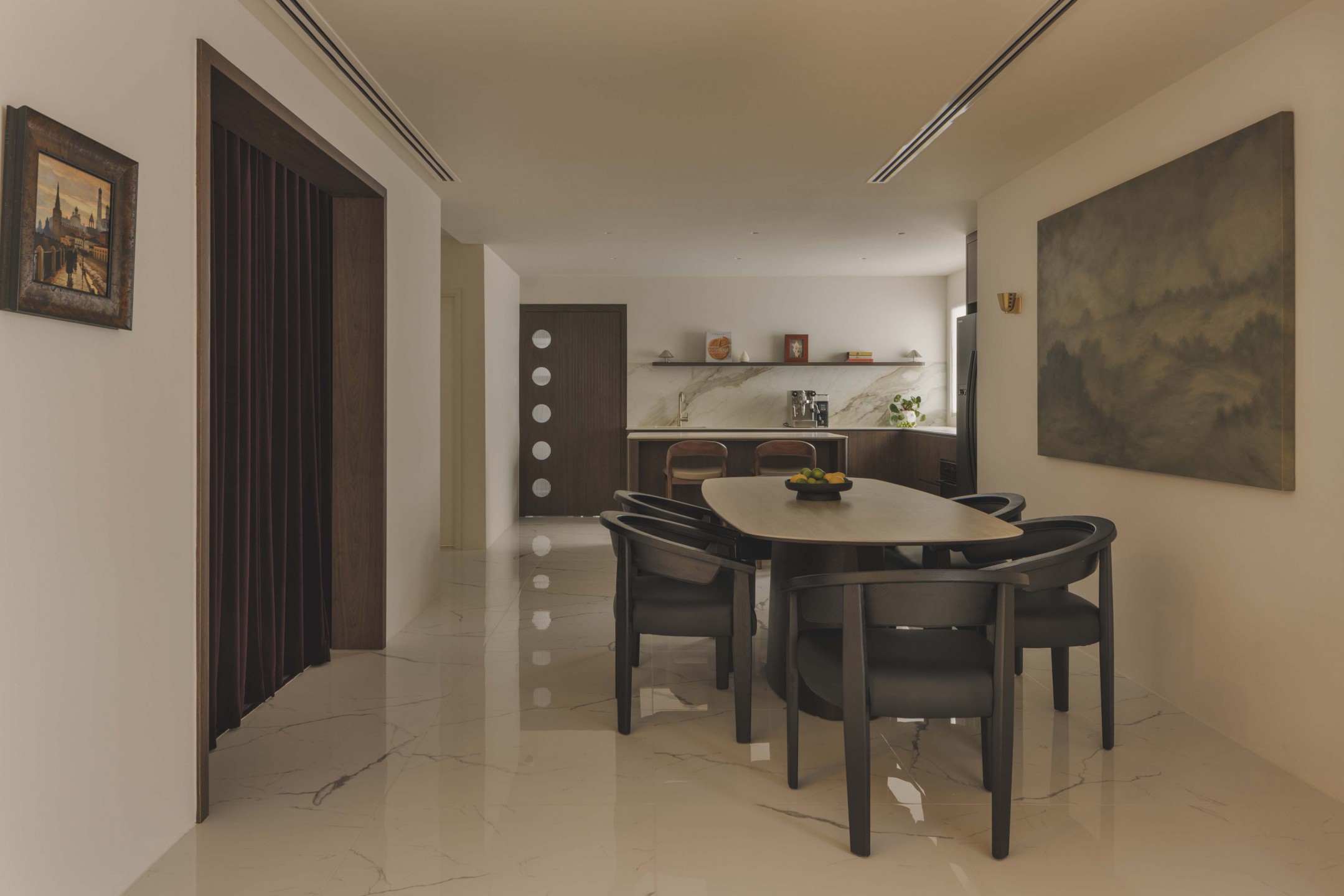
The home’s existing split-level layout also proved useful in defining the hosting zone, which comprises the dining area, dry pantry, and a bar concealed behind a velvet curtain. Framed with a textured ceiling, curved wall panels, and an oversized rug, the space feels less like a family home and more like a cocktail lounge.
“We wanted to make sure when someone goes into this room, they are immediately teleported out of the space into an actual bar,” explained Agnes.
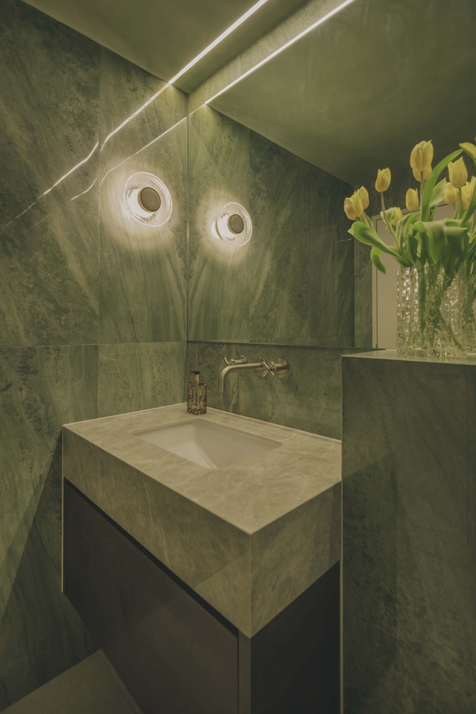
This element of surprise continues in the guest bathroom, where the designers created a “wow” factor by drenching the entire space in green marble. It’s not a conventional material for the common bathroom, but it stays true to the designer’s commitment to distinguishing spaces within the home down to the very last corner.
Another Side of the Home
While the spaces on the ground floor are decidedly bold, the mood upstairs shifts towards something more restorative, beginning with the bathrooms.
The guest en-suite bathroom, which could easily be mistaken for a master bathroom, was enlarged to accommodate a his-and-hers vanity, a freestanding bathtub and an oversized shower area. Clad in onyx marble tiles with a cloud-like appearance, the space was designed to evoke a dreamier atmosphere.
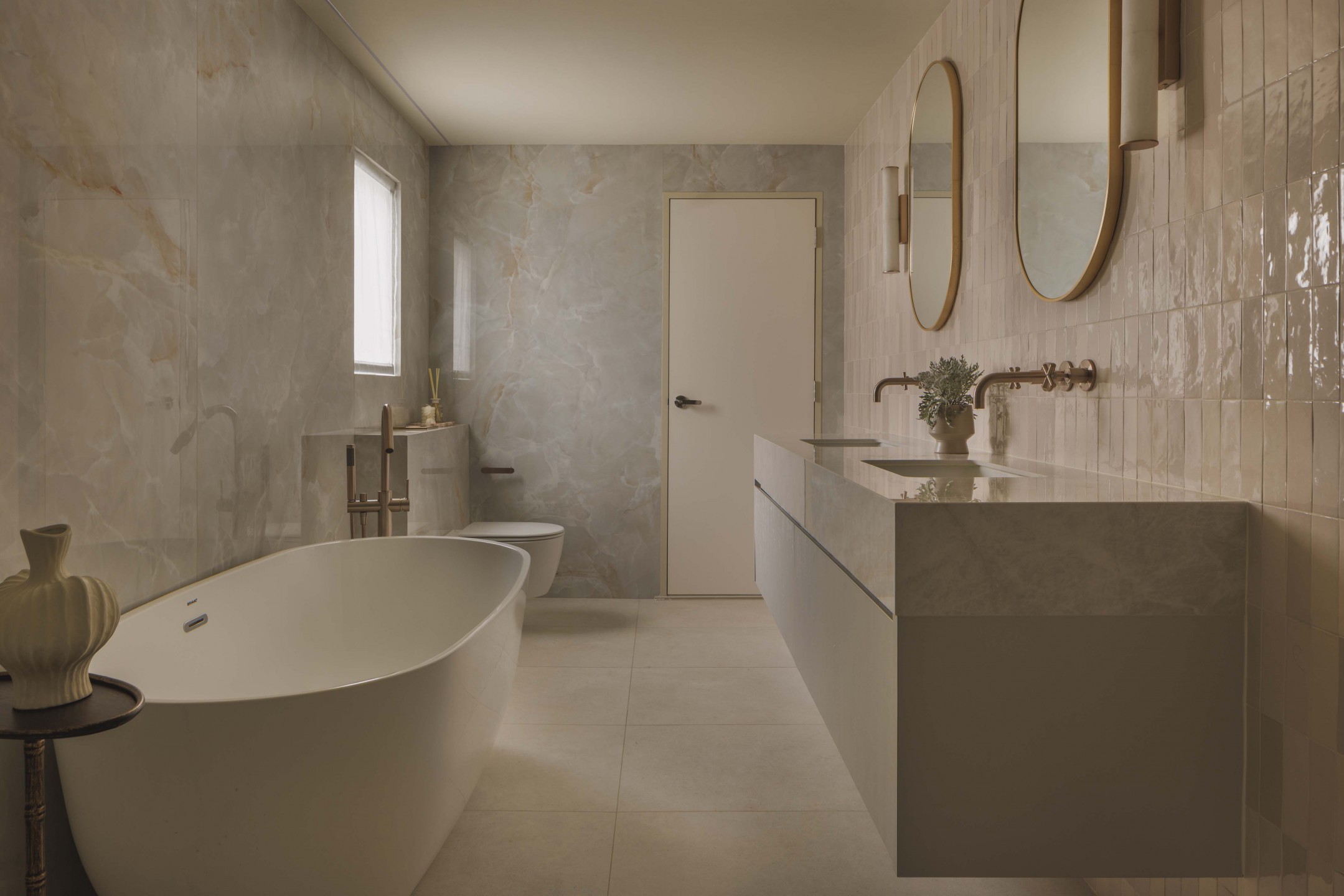
“It’s safe to say that this bathroom is designed to let people feel like they would want to spend hours in there, taking a nice long soak in the bathtub while reading a book and having a glass of wine.”
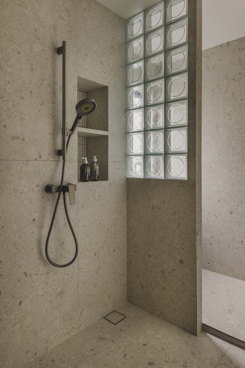
Their son’s en-suite bathroom serves a more practical purpose, housing a secondary washer so the family can do laundry upstairs. But it’s by no means an afterthought. To brighten the space despite the wall segregation, the designers incorporated glass blocks among a variety of textures.
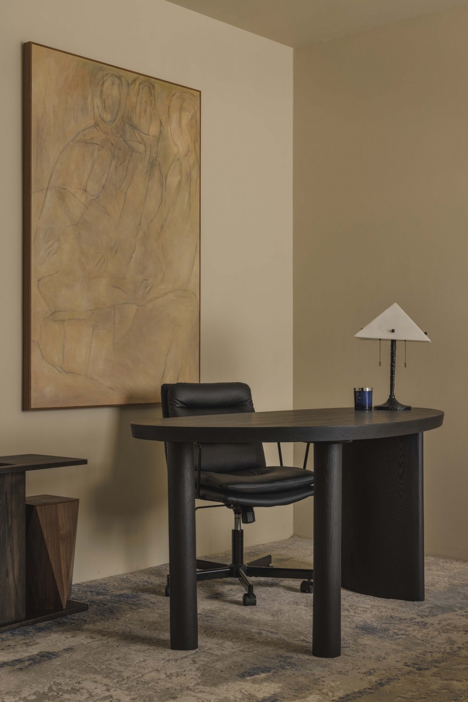
Likewise, the study doesn’t look much like the conventional home office. As the designers had envisioned it as a workstation within a boutique hotel suite, they furnished it with curved tables instead of rectangular ones, and decorated the room so it would be as inviting as it is practical.
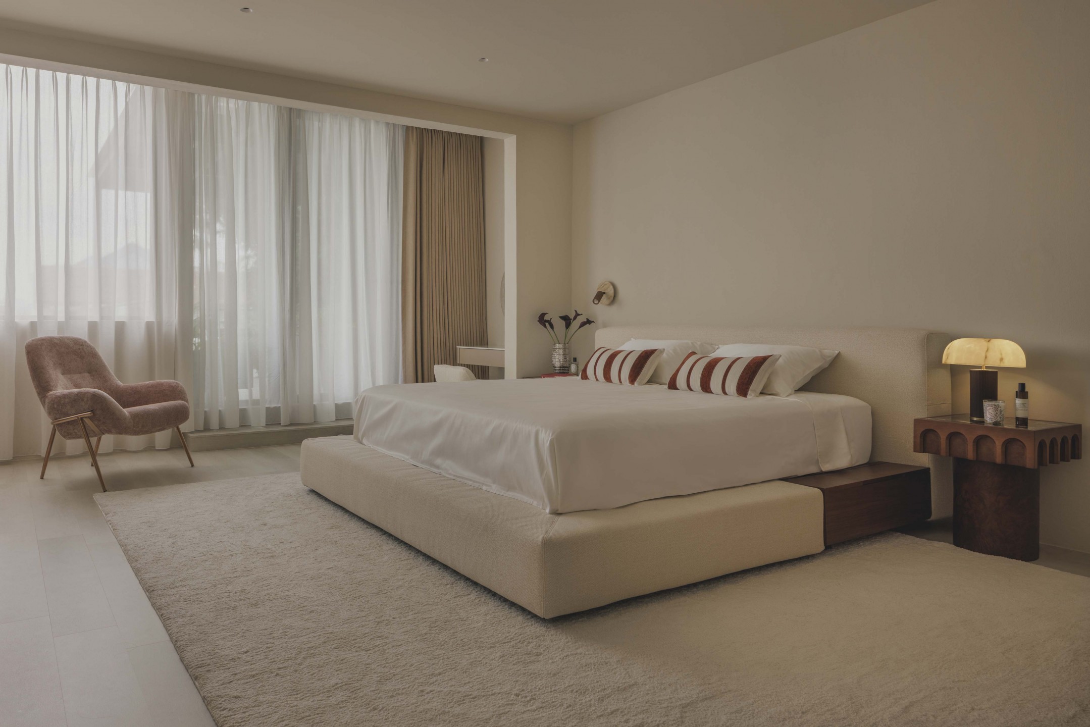
This understated approach carries through to the master suite. Here, the designers also tucked the homeowners’ vinyl and book collections in a corner, creating a secondary living space that remains out of sight upon entering the room.
Even the walk-in wardrobe was designed to recede into the background. Because it sits directly opposite the bed, the designers relied on a restrained palette to minimise its visual presence.
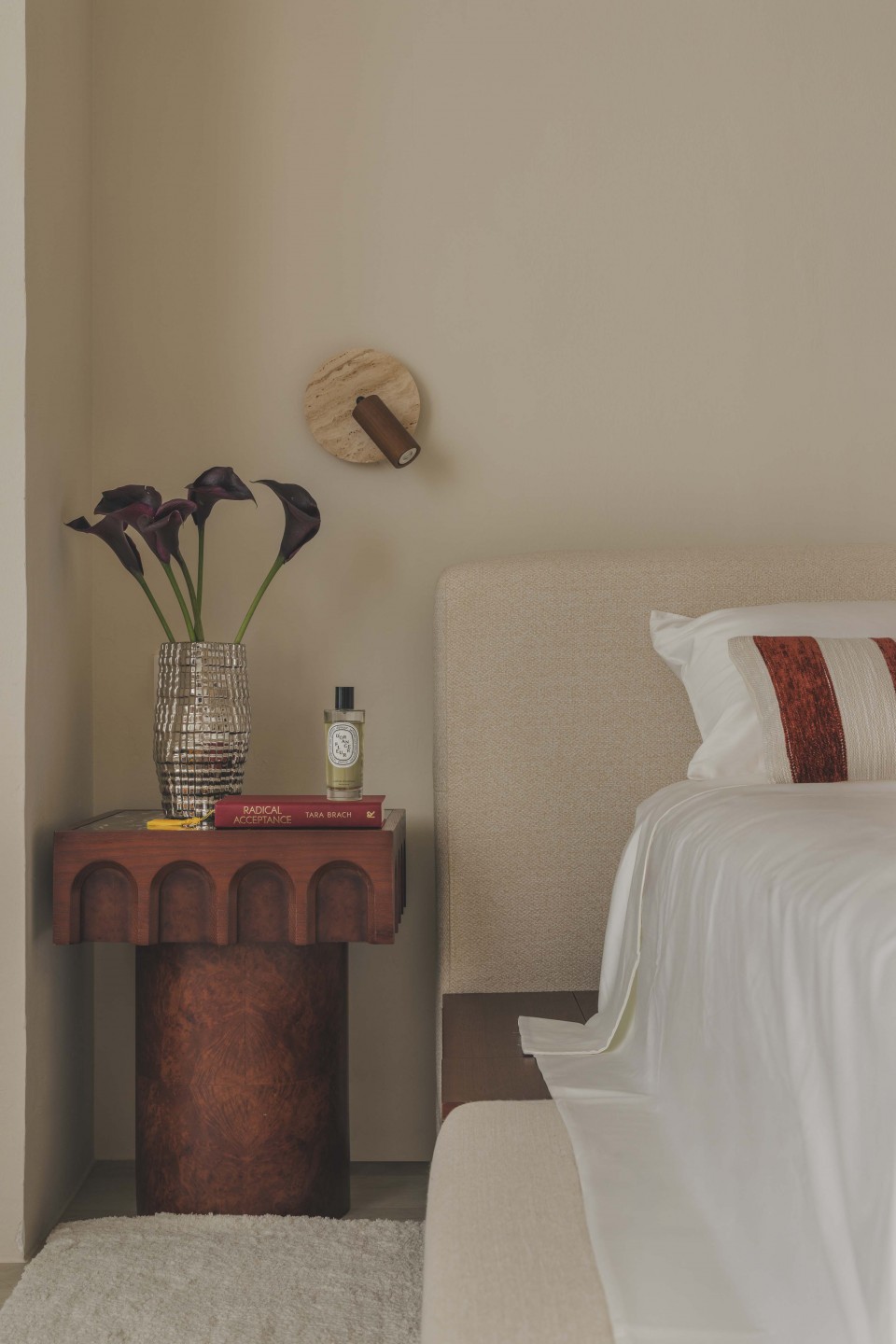
Thanks to the full-height windows, the sleeping area is bathed in natural light, which bounces off the blush-toned walls to create a softer, less masculine atmosphere. These hues continue into the master bathroom, which looks like an extension of the bedroom.
Yet, the space still ends on a striking note, with the entire shower area wrapped in white marble accented with blush detailing.
“We wanted a very grand and spacious shower area, so we chose to go with cleaner, whiter marble tiles with blush accents to dramatically enhance the space,” said Agnes.
“We love how the bathrooms, despite their small footprint, gave us the opportunity to create distinctive pockets of space within the larger home.”


