Through the use of unobtrusive furnishings and soothing shades of brown, this apartment’s appeal lies in its efficient design and calming atmosphere. Thought up by Vin Cenz of Weiken.com, this uncomplicated home is heavily influenced by Japanese interior design styles, which are famous for their minimalist and clean visual profiles and unparalleled tidiness.
FACT FILE
Space: 4-room HDB unit
Size: Approx. 1,000 square feet
Location: Ang Mo Kio Street 51
Home to: 2 adults
Designer: Vin Cenz from Weiken.com@Oxley
Reno Period: 6 weeks
Living
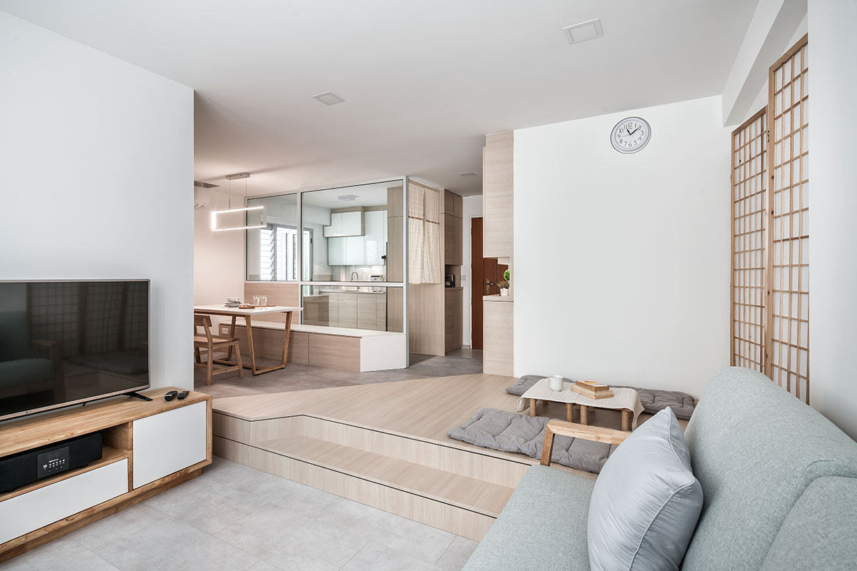
As the homeowners are fans of neutral tones, the use of concrete-looking vinyl flooring in the communal spaces complements well with the zone’s grey and wood-toned furnishings. Meanwhile, an elevated platform clad in light woodgrained laminates was customised and installed to create a separation between the living and dining zones.
Dining
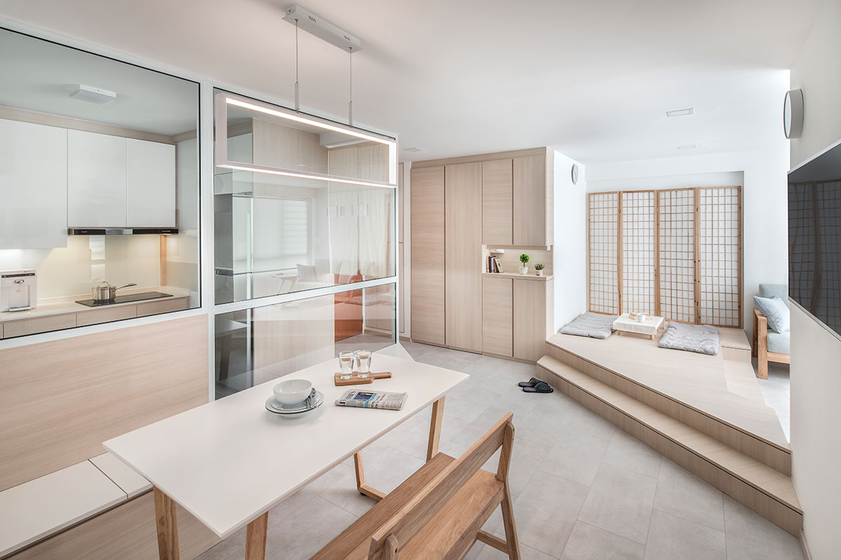
Maximising the available space, Vin Cenz customised a dining bench that takes up the entire length of the kitchen’s glass partition wall, which offers more seating arrangements whenever necessary. One unique feature about the dining bench is that it ends off with a slanted edge, which is parallel to the opposing steps of the elevated platform. By doing so, the corridor that leads to the private sleeping chambers doesn’t have any sharp edges jutting out, creating a clean and streamlined pathway.
Kitchen Entrance
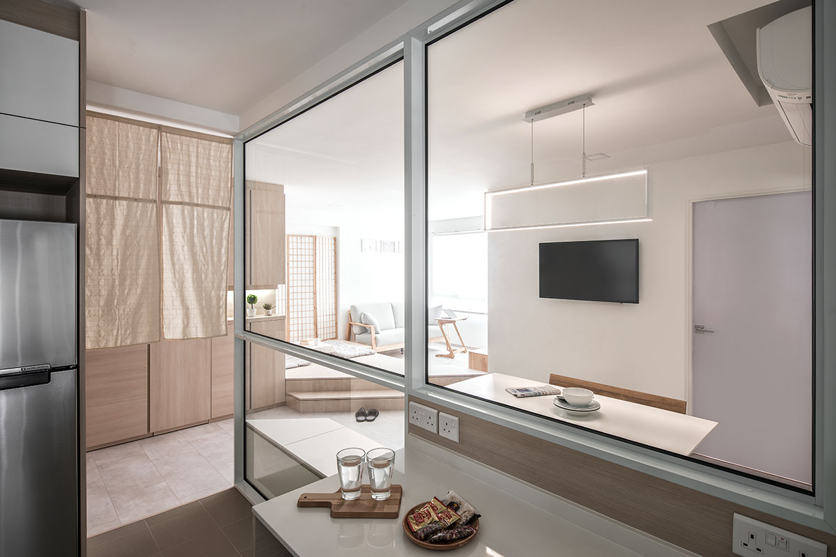
As using a glass door would have made the kitchen feel too closed off from the rest of the house, the designer hung two vertical beige cloths at the entrance instead. Resembling Noren – traditional fabric dividers that are most commonly seen at the entrance of Japanese restaurants – the addition of these cloths also enhances the Japanese vibe of the home.
Kitchen
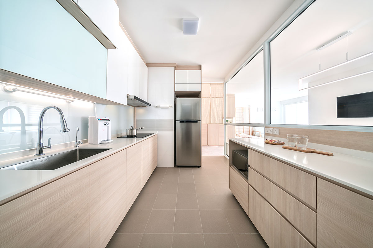
Even though the homeowners don’t cook often, there was a need for additional countertop space to accommodate their frequent family gatherings. As such, a kitchen island with built-in storage drawers was installed. Meanwhile, the perimeter walls of the kitchen were knocked down in favour of glass partitions. This design modification prevents any cooking odours from permeating to the outer communal areas, but still allows people in the kitchen to maintain visual contact with those outside.
Master bedroom
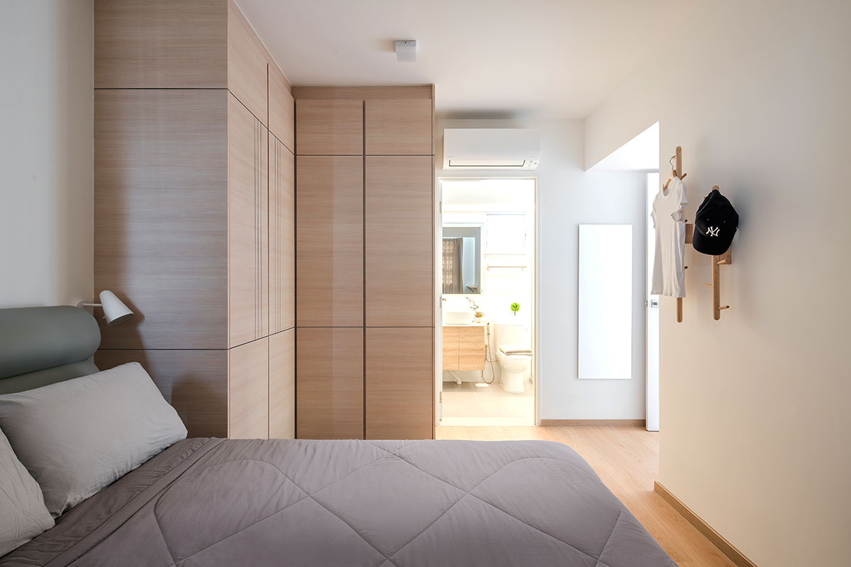
Continuing the minimalist design concept into the private living chambers, the master boudoir was kept relatively simple, save for
a pair of wall-mounted clothing racks near the entryway. Meanwhile, a series of floor- to-ceiling L-shaped wardrobe units were installed to house the occupants’ clothings and other accessories. For visual consistency between the two spaces, the laminates used here are the same ones used for the shoe cabinet along the living room’s entryway.
About Weiken.com
For over 22 years, Weiken.com has satisfied its customers with an effective combination of attentive service and innovative design ideas. Offering a “one-stop service” for renovation projects, the Weiken.com team is meticulous in matching interior solutions to project requirements. This quality of work is ensured by effective work processes that provide clients with peace of mind at every stage of a renovation project.
Address
18 Boon Lay Way, #01-133, Tradehub 21, Singapore 609966
2 Jurong East St 21, #03-28F, IMM Building, Singapore 609601
24 Sin Ming Lane, #01-103, Midview City, Singapore 573970
62 Ubi Road 1, #01-04, Oxley Bizhub 2, Singapore 408734
Tel: 6465 6656
Email: [email protected]
This post was adapted from an article originally published in IdealHomes Vol. 10.


